 Publish
Anchor link Requirements
Anchor link Setting up
The easiest way to install Publish is using DADI CLI. CLI is a command line application that can be used to create and maintain installations of DADI products.
There are two ways to create a new Publish installation with the CLI: either manually create a new directory for Publish or let CLI handle that for you. DADI CLI accepts an argument for project-name which it uses to create a directory for the installation.
Manual directory creation
$ mkdir my-publish
$ cd my-publish
$ npx dadi-cli publish new
Automatic directory creation
$ npx dadi-cli publish new my-publish
$ cd my-publish
DADI CLI will install the latest version of Publish and copy a set of files to your chosen directory so you can launch Publish immediately.
Installing DADI Publish directly from NPM
All DADI platform microservices are also available from NPM. To add Publish to an existing project as a dependency:
$ cd my-existing-node-app
$ npm install --save @dadi/publish
Anchor link Application anatomy
When CLI finishes creating your Publish installation, the application directory will contain the basic requirements for launching Publish. The following directories and files have been created for you:
my-publish/
  config/              # contains environment-specific configuration files
    config.development.json
  server.js            # the entry point for the application
  package.json
Anchor link Configuration
Publish reads a series of configuration parameters to define its behaviour and to adapt to each environment it runs in. These parameters are defined in JSON files placed inside the config/ directory, named as config.{ENVIRONMENT}.json, where {ENVIRONMENT} is the value of the NODE_ENV environment variable. In practice, this allows you to have different configuration parameters for when Publish is running in development, production and any staging, QA or anything in between, as per the requirements of your development workflow.
Some configuration parameters also have corresponding environment variables, which will override whatever value is set in the configuration file.
The following table shows a list of all the available configuration parameters.
| Path | Description | Environment variable | Default | Format | |
|---|---|---|---|---|---|
apis |
Connected APIs (see Adding an API) | Array | |||
app.name |
The name of the application | DADI Publish (Repo Default) |
String | ||
app.publisher |
The name of the organisation the application belongs to | DADI |
String | ||
cdn.publicUrl |
The host of the URL where the CDN instance can be publicly reached | ||||
env |
The application runtime environment | NODE_ENV |
development |
String | |
formats.date.long |
The specifier to use when displaying dates in long format | YYYY/MM/DD HH:mm |
String | ||
formats.date.short |
The specifier to use when displaying dates in short format | YYYY/MM/DD |
String | ||
ga.enabled |
If true, the collection of Google Analytics events is enabled |
false |
Boolean | ||
ga.trackingId |
A Google Analytics tracking ID | String | |||
publicUrl.host |
The hostname of the URL where the Publish instance can be publicly reached | URL_HOST |
String | ||
publicUrl.port |
The port of the URL where the Publish instance can be publicly reached | URL_PORT |
Number | ||
publicUrl.protocol |
The protocol of the URL where the Publish instance can be publicly reached | URL_PROTOCOL |
http |
String | |
server.host |
The IP address or interface to bind to | 0.0.0.0 |
String | ||
server.port |
The port to bind to | 3001 |
Number | ||
server.protocol |
The protocol the application will use | PROTOCOL |
http |
String | |
server.redirectPort |
Port from which to redirect HTTP connections to HTTPS | 0 |
Number | ||
server.sslPrivateKeyPath |
The path to a SSL private key | SSL_PRIVATE_KEY_PATH |
String | ||
server.sslCertificatePath |
The path to a SSL certificate | SSL_CERTIFICATE_PATH |
String | ||
server.sslPassphrase |
The passphrase of the SSL private key | SSL_PRIVATE_KEY_PASSPHRASE |
String | ||
server.sslIntermediateCertificatePath |
The path to a SSL intermediate certificate, if any | SSL_INTERMEDIATE_CERTIFICATE_PATH |
String | ||
server.sslIntermediateCertificatePaths |
The paths to SSL intermediate certificates, overrides sslIntermediateCertificate (singular) | SSL_INTERMEDIATE_CERTIFICATE_PATHS |
Array | ||
server.healthcheck |
If enabled, Publish continuously checks the connection with the server using the server.healthcheck.frequency setting as the interval between checks |
"healthcheck": { "enabled": true, "frequency": 15000 } |
|||
server.healthcheck.enabled |
If true, the health check service is enabled |
true |
Boolean | ||
server.healthcheck.frequency |
Interval between health checks, in milliseconds | 2000 |
Number | ||
logging.enabled |
If true, logging is enabled using the following settings. | true |
Boolean | ||
logging.level |
Sets the logging level. | info |
String. Must be one of debug, info, warn, error, trace |
||
logging.path |
The absolute or relative path to the directory for log files. | ./log |
String | ||
logging.filename |
The name to use for the log file, without extension. | publish |
String | ||
logging.extension |
The extension to use for the log file. | log |
String | ||
logging.accessLog.enabled |
If true, HTTP access logging is enabled. The log file name is similar to the setting used for normal logging, with the addition of \"access\". For example publish.access.log. |
true |
Boolean | ||
whitelabel |
Customisation options for displaying a different logo and background images | "whitelabel":\{"backgroundImage": "", "logo": "", "poweredBy": true} |
|||
whitelabel.backgroundImage |
The path to a file to use as the background image | String | |||
whitelabel.logo |
The path to a file to use as the logo | String | |||
whitelabel.poweredBy |
If true, displays a "Powered by DADI Publish" section |
false |
Boolean |
Anchor link Launching the application
After configuring the application, you can start the Publish server by entering its directory and running npm start. You should see in the console a message similar to the one below, confirming that the application is now running and telling you what is the host and port you should use to access it.
✔ Started @dadi/publish
@ http://localhost:3003
  ┌──────────────────────────────────────────┐
  │ DADI Publish - Publisher Name            │
  ┌──────────────┬───────────────────────────┐
  │ Version      │ 2.0.0                     │
  │ Node.js      │ 8.12                      │
  │ Environment  │ development               │
  └──────────────┴───────────────────────────┘
  ℹ Documentation at https://docs.dadi.cloud
  ℹ <CTRL> + C to shut down
   ▓▓▓▓▓  ▓▓▓▓▓▓▓
               ▓▓▓▓
      ▓▓▓▓▓▓▓    ▓▓▓▓
               ▓▓▓▓
          ▓▓▓▓▓▓▓
  © 2018 DADI+ Limited (https://dadi.cloud)
  All rights reserved.
To access the application, open the URL above in your browser.
Anchor link Adding an API
If you access the application without configuring an API, you'll see an error message telling you that your instance of Publish hasn't been configured. To fix that, create a new API if you don't have one already and add its details (host and port) to the apis block of your Publish configuration file.
{
  "apis": [
    {
      "host": "https://api.somedomain.tech",
      "port": 443
    }
  ]
}
After doing so, restart the application and the error message should be gone.
To sign in, you must have a username and password, which you can obtain by creating an API client if you don't have one already. If you do, type the client's ID and secret into the username and password fields to authenticate with Publish.
Anchor link Configuring an API
Anchor link Navigation menu
Publish displays a navigation menu containing the collections returned from the connected API. By default, the navigation items are in the order received from the API.
The configuration file allows a menu property that can be used to customise the navigation menu in two ways:
- by modifiying the order of items, and
- by creating menu groups to keep related collections together.
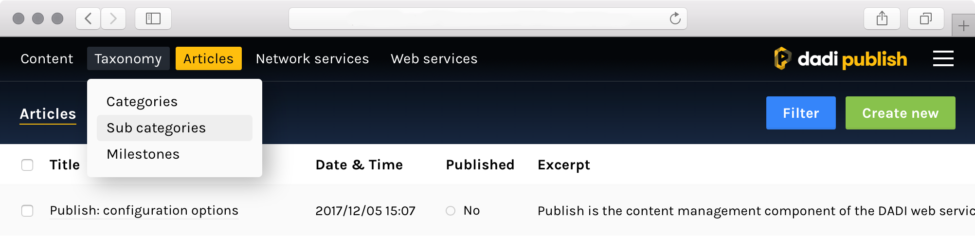
The following menu configuration is used to render the navigation menu as shown below. Notice that any collections not specified in the menu configuration are displayed in alphabetical order after the explicitly configured menu items.
"menu": [
  {
    "title": "Content",
    "collections": [
      "pages",
      "team"
    ]
  },
  {
    "title": "Taxonomy",
    "collections": [
      "categories",
      "sub-categories",
      "milestones"
    ]
  }
]
Anchor link Extending collection settings
Publish has been designed in such a way that it can connect to an existing instance of DADI API and work right out of the box, without requiring any additional configuration. Optionally, it can use a variety of extended field values to enhance the user interface and aid with document operations. These fields are defined in an optional publish object that can be added to the settings block of any collection schema.
The following table shows a list of available properties.
| Property | Description | Example | Default |
|---|---|---|---|
hidden |
Hides a collection from the navigation menu | true |
false |
By default, the navigation menu will display all collections that the user has access to. If you need to hide a specific collection from the menu, add a publish.hidden property to the collection's settings block.
In the below example, the publish block in the collection settings instructs Publish to hide this particular collection from the navigation menu.
{
  "fields": {
    "title": {
      "type": "String"
    }
  },
  "settings": {
    "publish": {
      "hidden": true
    }
  }
}
Anchor link Extending field settings
Similarly to extending collection settings, it's also possible to extend the functionality of individual fields in a collection schema. This can be done by adding an optional publish block to the object that defines a field within the collection schema.
The following table shows a list of available properties.
| Property | Description | Example | Default |
|---|---|---|---|
section |
The tabbed section this field should be displayed in | "Details" |
"General" |
placement |
The location of the field within the document view, options are "main" and "sidebar" |
"main" |
"sidebar" |
display.list |
If true, the field is displayed in the document list view |
true |
true |
display.edit |
If true, the field is displayed in the document edit view |
true |
true |
readonly |
If true, the field is not editable in the document edit view |
true |
false |
multiline |
If true, String fields are rendered with a multiline textarea rather than a text input |
true |
false |
options |
Limits the content of the field to a fixed set of values. It's defined as an array of objects containing value and label properties. When used with the String field, a dropdown is rendered |
[{"value": "uk", "label": "United Kingdom"}] |
N/A |
multiple |
Defines whether the field allows multiple values. When used with the String field and options is defined, a multi-select dropdown is rendered |
true |
false |
limit |
Defines the maximum number of values allowed in the field. Overrides multiple |
10 |
1 |
subType |
Defines an optional subType for the field. | Image |
None |
In the below example, the publish block for the title field instructs Publish to:
- display the field in a tabbed section called "General"
- display the field in the "main" panel of the interface
- display the value of the field in the document list view
- allow the field to be edited in the document edit view
"fields": {
  "title": {
    "type": "String",
    "label": "Title",
    "required": true,
    "publish": {
      "section": "General",
      "placement": "main",
      "display": {
        "list": true,
        "edit": true
      }
    }
  }
}
Anchor link Listing documents
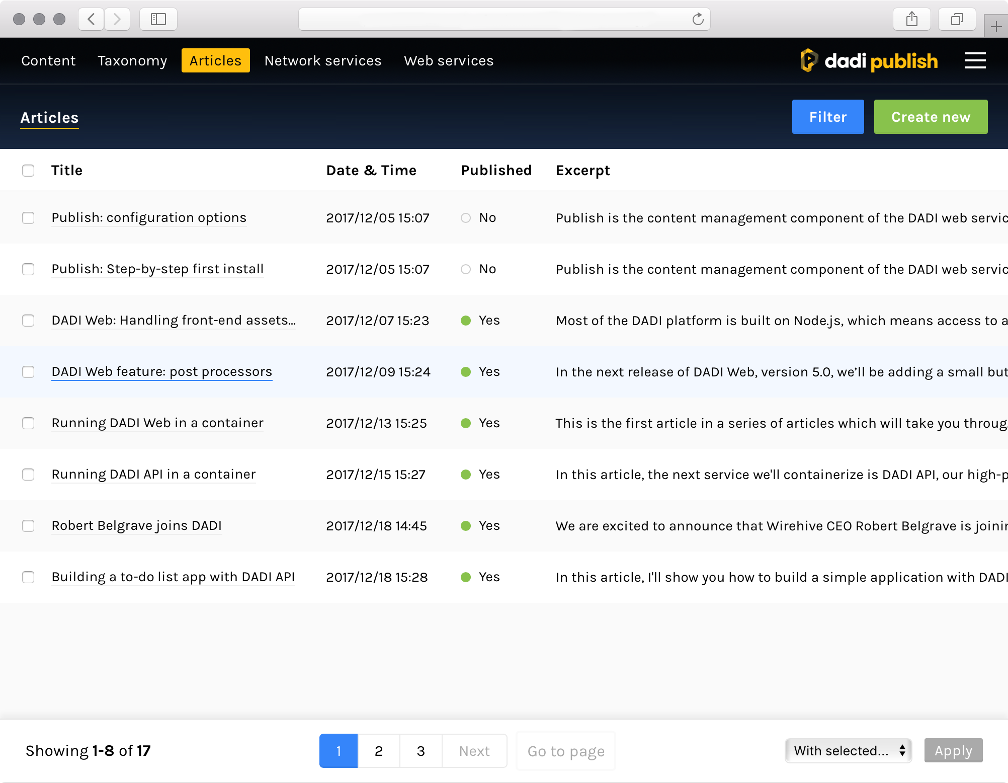
Clicking on a collection on the navigation menu leads to the document list view, where it's possible to browse all the documents within a collection.
A table will display all the documents in the collection, with a column for each field and a row for each document. Clicking on the first field of a row takes users to the edit view, where it's possible to view and edit the corresponding document.
Anchor link Showing and hiding fields
By default, all fields in the collection (that the user has access to) will be shown in the table, sorted by their order of appearance in the collection schema. When the collection has a large number of fields, this may not be desirable.
For that reason, it's possible to specify which fields are shown in this view by annotating the field settings block. To hide a particular field, set publish.display.list to false in its configuration block.
"fields": {
  "notInteresting": {
    "type": "String",
    "publish": {
      "display": {
        "list": false
      }
    }
  }
}
It's important to note that setting this property to false acts as a blacklist: except for the ones explicitly excluded, all fields will be displayed, even the ones without a display.list property or a publish block.
Conversely, when at least one of the fields has this property set to true, the logic is reversed and the principle of a whitelist applies, meaning that only fields with display.list explicitly set to true will be shown.
Anchor link Pagination
Publish automatically separates documents into pages and includes controls on the bottom toolbar to navigate between them: you can click on Prev or Next to go to the previous or next page, click on a specific page number or type the page number on the Go to page input.
The number of documents that are shown for each page is determined by API, not Publish. It can configured by changing the count property in the collection settings.
Anchor link Sorting
It's possible to sort documents by any field shown in the table by clicking on the corresponding table header. Once a field has been selected, it's possible to change the sort order (ascending or descending) by clicking on the same header.
Anchor link Bulk actions
Each row shows a checkbox on the leftmost part of the row. This can be used to make a selection of documents and perform actions on them as a group. When a selection is made, the dropdown labelled as With selected on the bottom toolbar will be unlocked, showing all the bulk actions available.
After selecting one, clicking the Apply button confirms the operation.
Anchor link Filtering
Publish offers a selection of filters that makes it possible to search for specific documents in the collection, or define a list of criteria for narrowing down the document set displayed.
The quickest way to add a filter is to use the search bar on the top-left corner of the screen, labelled with Search [collection name]. As you type, a dropdown will allow you to quickly select the field to search in. Only fields of type String will be shown in this view.
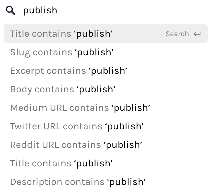
To filter by fields of other types, or to add more complex filters including operators like does not equal or a literal match, click the Add filter button on the top-right corner.
The currently applied filters will be shown next to the search bar. Click on an individual filter to edit it, or hit X to remove it.
Anchor link Editing documents
Clicking on a document in the document list view leads to the document edit view, where it's possible to view the full content of a document as well as make changes to it.
Anchor link Showing and hiding fields
By default, all fields in the collection (that the user has access to) will be shown in the editing interface, but it's possible to change this behaviour by annotating the field settings block. To hide a particular field, set publish.display.edit to false in its configuration block.
"fields": {
  "notInteresting": {
    "type": "String",
    "publish": {
      "display": {
        "edit": false
      }
    }
  }
}
It's important to note that setting this property to false acts as a blacklist: except for the ones explicitly excluded, all fields will be displayed, even the ones without a display.edit property or a publish block.
Conversely, when at least one of the fields has this property set to true, the logic is reversed and the principle of a whitelist applies, meaning that only fields with display.edit explicitly set to true will be shown.
Anchor link Organising fields into sections
To avoid a cluttered interface when a collection has a large number of fields and to make fields easier to find, it's possible to group fields into tabbed sections by annotating the field with a section property within the field settings block. Each section will appear as a tab at the top of the document edit view.
The example below places the title field in a section called Details and the isbn field in a section called Meta.
"title": {
  "publish": {
    "section": "Details"
  }
},
"isbn": {
  "publish": {
    "section": "Meta"
  }
}

If no fields have an assigned section, no tabs will be shown and all fields will be grouped together in a single page. If at least one field has an assigned section, any fields without a section will be placed in a section called Other.
Anchor link Changing field placement
Another level of customisation for the editing interface is the ability to control which part of the editing interface a field appears in. With the placement property within the field settings block, it's possible to place fields in the main column, by setting the property to "main", or in the sidebar, with the value "sidebar".
The main column takes up two thirds of the horizontal space, whilst the sidebar fills up the remaining third.
"title": {
  "publish": {
    "section": "Details",
    "placement": "main"
  }
},
"slug": {
  "publish": {
    "section": "Details",
    "placement": "sidebar"
  }
}

When a placement property isn't defined, fields will be placed in the main column.
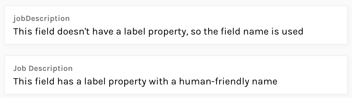
Anchor link Field labels
Each field is identified by a label placed on the top-left corner of its container. By default, this is populated by the name of the field as it is defined in the collection schema, which is usually not an optimal value since this value was designed as a machine-friendly slug (e.g. it cannot contain spaces or non-alphanumeric characters).
It's possible to customise this name by specifying a label property in the field definition block.
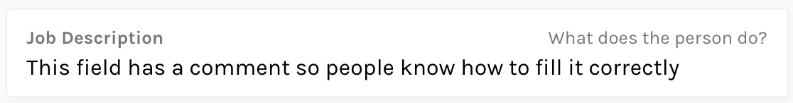
"jobDescription": {
  "type": "String",
  "label": "Job Description"
}
Anchor link Field comments
In situations where it may not be obvious what the field should contain, or what format the input is expected to be in, it's possible to define a comment that will be displayed on the top-right corner of the field. This can be done by adding a comment property to the field definition block.
"jobDescription": {
  "type": "String",
  "label": "Job Description",
  "comment": "What does the person do?"
}
Anchor link Validation
Publish will validate fields as per the validation rules defined in the collection schema. These rules can be as simple as marking a field as required, or specifying a strict pattern that values must comply with, such as an email address.
When a field is failing the validation rules, its background changes to a light red and a message is shown indicating what the error is. If the field is part of a tabbed section, a warning icon will appear next to the tab.
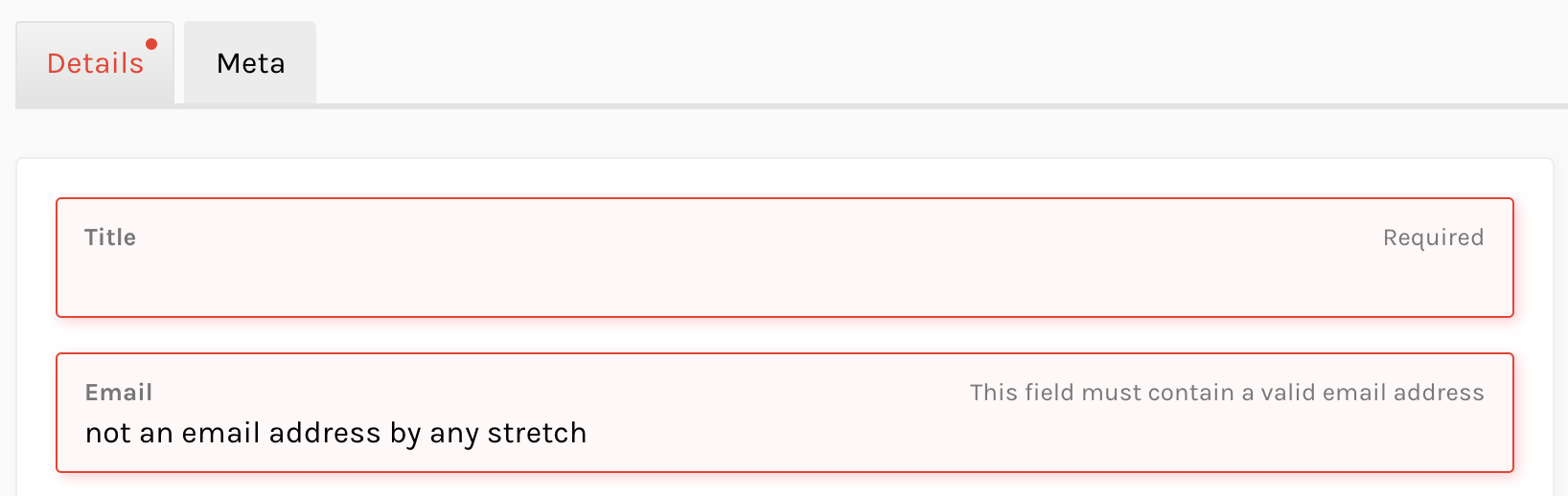
The interface will not let users save the document until all validation errors are corrected.
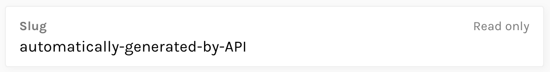
Anchor link Read-only fields
A collection might have fields whose value is generated by a third-party application or even by API itself – for example, a hook that generates a URL-friendly slug from a human-friendly title. In these cases, it's useful to show this field in the editing interface, but not allow editors to change its value.
This is possible with the readonly property in the field settings block.
"slug": {
  "type": "String",
  "publish": {
    "readonly": true
  }
}
Anchor link Creating documents
To create a new document, select the collection using the navigation menu and click on the Create new button on the top-right corner. You'll be taken to the same editing interface described in Editing documents.
Anchor link Enhanced fields
Publish knows how to render most of the primitive field types supported by DADI API. String fields will be rendered as text inputs, Boolean as checkboxes, etc. Whilst these should be enough to cover most situations, other components are included with the application, offering editors more optimal ways of controlling certain field types.
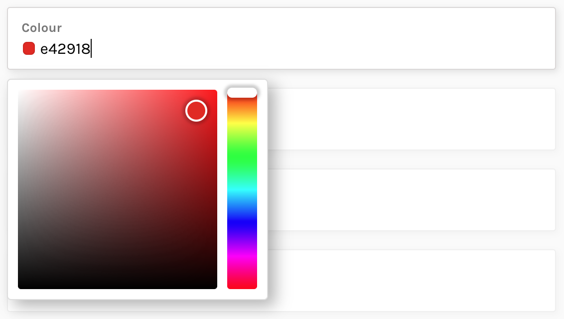
Anchor link Colour
When a colour is stored as a hexadecimal code in a String field, it's possible to render a colour picker with a palette and hue selectors, as well as a small colour swatch next to the field value.
To enable it, define a subType property with the value of "Color" within the field settings block.
"color": {
  "type": "String",
  "label": "Colour",
  "publish": {
    "subType": "Color"
  }
}
Anchor link Images
The recommended way of referencing an image is by using a field of type Media, in which case Publish automatically renders a component that allows users to select any item from the media library, or upload new images using drag and drop or the operating system's file selector.
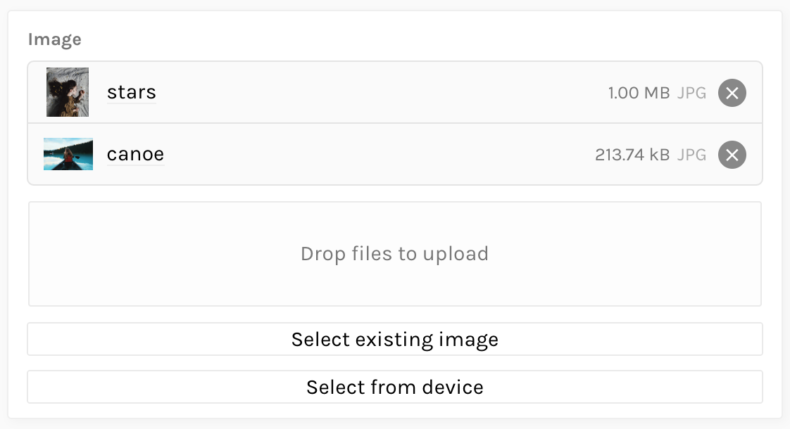
For backwards-compatibility, it's also possible to render the same interface when using a Reference field, by providing a subType property with the value of "Media".
"image": {
  "type": "Reference",
  "settings": {
    "collection": "mediaStore"
  },
  "publish": {
    "subType": "Media"
  }
}
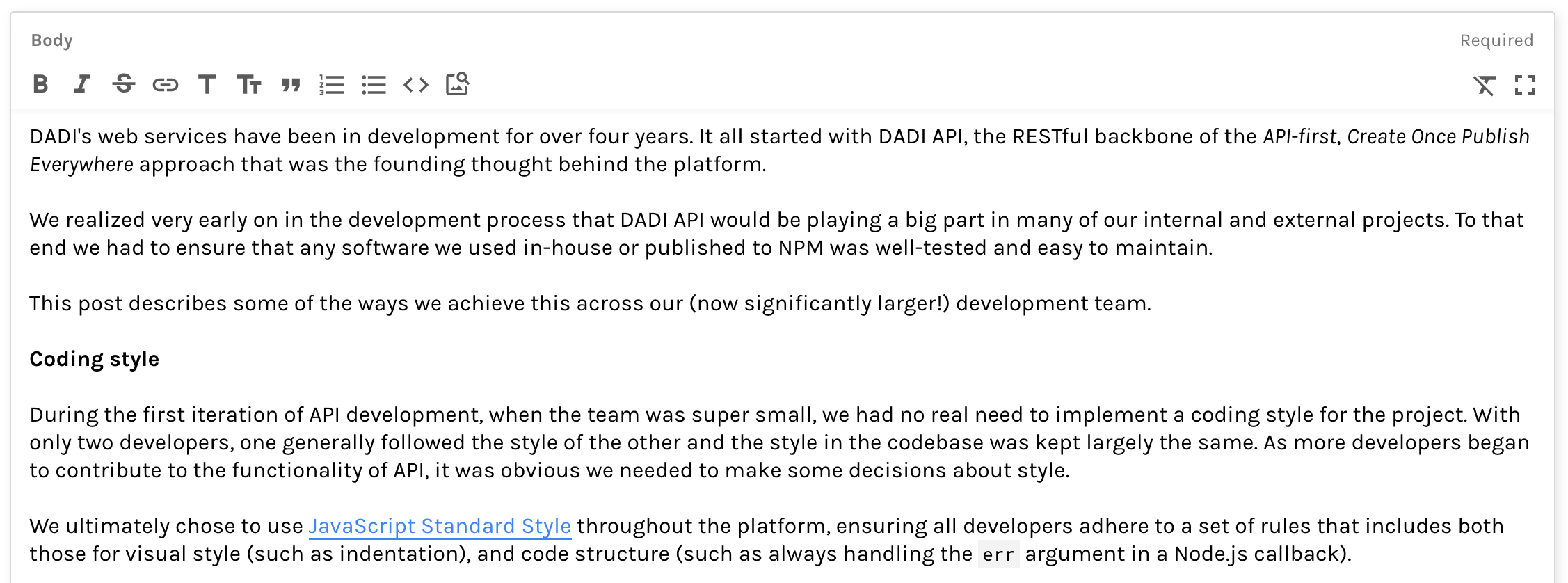
Anchor link Rich editor
A String field can declare what format it expects its input to be in (e.g. plain text, HTML, Markdown, etc.), using the format property in the field definition block. For some of these formats (currently limited to Markdown), Publish can offer a rich editor with formatting controls.
"body": {
  "type": "String",
  "label": "Body",
  "format": "markdown"
}
Anchor link Media library
Publish seamlessly integrates with DADI API's support for media files and provides a set of views that allow you view, edit and create new media items.
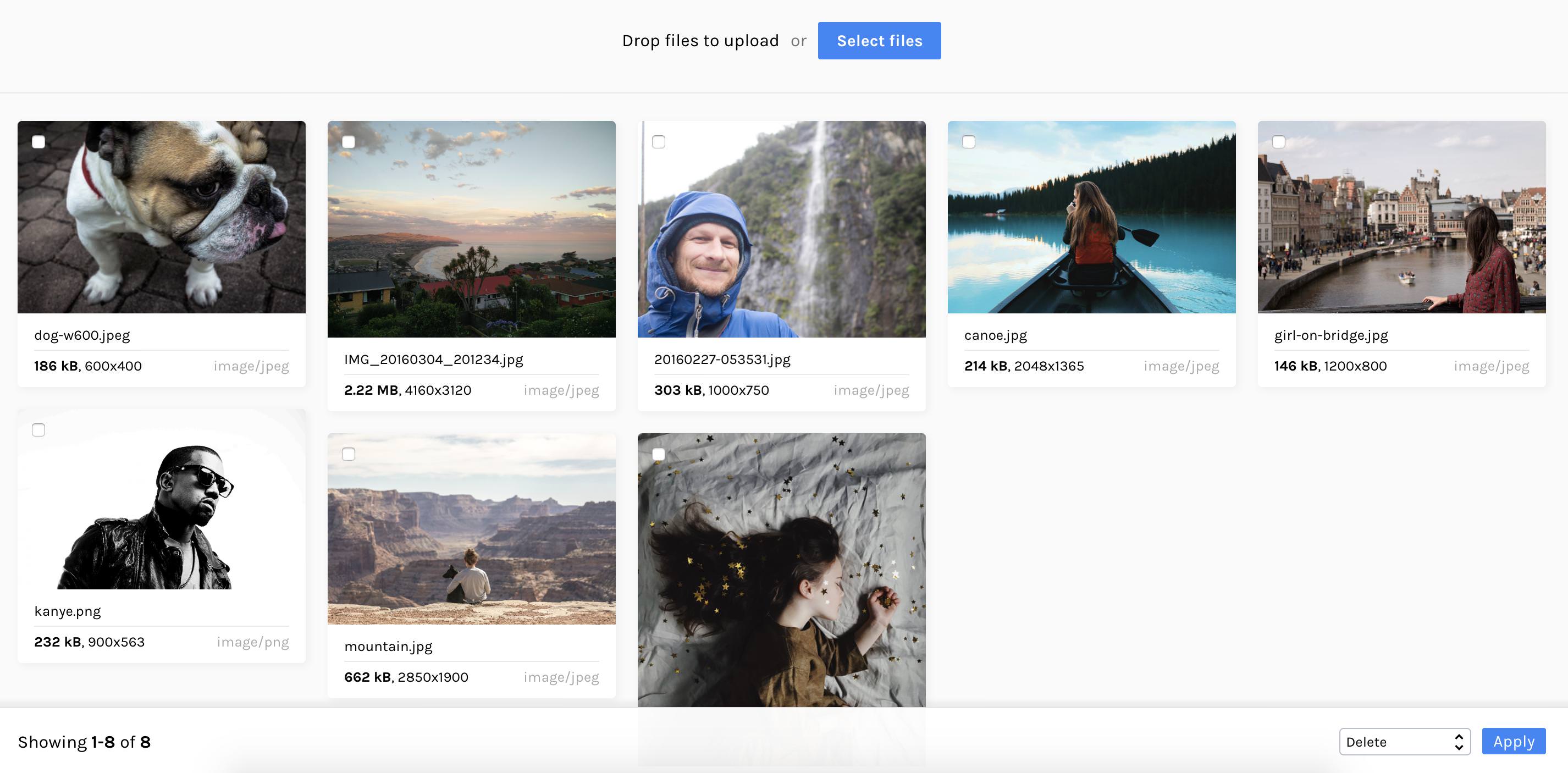
Anchor link Listing media items
In addition to all configured collections, the navigation menu contains a link to the Media Library. In there, a grid view shows all the available media items. Similarly to the document list view, clicking on an individual item leads to the editing interface and selecting multiple items allows you to perform bulk actions on them.
It's also possible to add new items to the media library straight from this view, by dragging an item onto the drop area at the top of the grid or clicking the Select files to launch the operating system's file explorer.
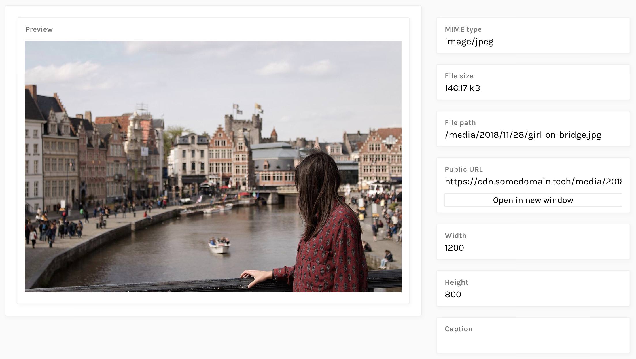
Anchor link Editing media items
Clicking on an individual media item brings up the media editing interface, which has a similar layout to the document editing interface. A preview of the file is shown, if one can be rendered, and some metadata that is automatically added by API is shown on the sidebar, such as the MIME type, file size and URL.
This interface also includes some additional metadata fields that can be edited, such as caption, alt text or copyright information.
Anchor link Customising the interface
Anchor link Changing the logo
To change the logo image that is displayed on both the sign-in page and the main interface, place the desired image file inside workspace/public and add a whitelabel.logo property to your Publish configuration file, setting the value to the name of the file.
Example:
{
  "whitelabel": {
    "logo": "my-logo.png"
  }
}
Anchor link Changing the sign-in page background
To change the background image that is used on the sign-in page, , place the desired image file inside workspace/public and add a whitelabel.backgroundImage property to your Publish configuration file, setting the value to the name of the file.
Example:
{
  "whitelabel": {
    "backgroundImage": "my-background.png"
  }
}
Anchor link Theming
Publish uses CSS variables to define various parameters for the interface, such as colours, text sizes and fonts. You can redefine any of these values, allowing you to create your own theme.
| Name | Description | Default |
|---|---|---|
--theme-colour-background |
Background colour for the main interface | #FFFFFF |
--theme-colour-background-shade-1 |
Background for the main interface (shade #1) | #FAFAFA |
--theme-colour-background-shade-2 |
Background for the main interface (shade #2) | #AAAAAA |
--theme-colour-background-shade-3 |
Background for the main interface (shade #3) | #EEEEEE |
--theme-colour-background-shade-4 |
Background for the main interface (shade #4) | #E4E4E4 |
--theme-colour-background-shade-5 |
Background for the main interface (shade #5) | #CBCBCB |
--theme-colour-data |
Data accent colour | #3585F9 |
--theme-colour-data-shade-1 |
Data accent colour (shade #1) | #1772FF |
--theme-colour-error |
Error accent colour | #E5462C |
--theme-colour-error-shade-1 |
Error accent colour (shade #1) | #982613 |
--theme-colour-error-shade-2 |
Error accent colour (shade #2) | #FEF8F8 |
--theme-colour-primary |
Primary/foreground colour | #000000 |
--theme-colour-primary-shade-1 |
Primary/foreground colour (shade #1) | #777777 |
--theme-colour-save |
Save accent colour | #88C24C |
--theme-colour-secondary |
Secondary colour | #FFFFFF |
--theme-colour-system |
System accent colour | #FFBF0D |
--theme-colour-system-invert |
System accent colour (inverted) | #040609 |
--theme-colour-highlight-1 |
Highlight colour #1 | #F3F8FF |
--theme-font-family |
Font family | 'Karla', 'Helvetica Neue', Arial, Helvetica, Geneva, sans-serif |
--theme-font-size-small |
Font size (small) | 13px |
--theme-font-size-normal |
Font size (normal) | 16px |
--theme-font-size-large |
Font size (large) | 20px |
To redefine a variable, create a file named custom.css within the workspace/public directory and set the value of each variable in the body selector.
Example:
body {
  --theme-colour-system: #2C55FF;
  --theme-colour-system-invert: #FFFFFF;
}